Popmenu Guest Journey & Service Presentation
Description
Part of a presentation given at our company kickoff in 2021. A storytelling journey from the perspective of 3 very different guests.
Why? - Problem
As Popmenu’s platform expanded, the guest experience was becoming increasingly fragmented across touchpoints. Restaurants needed a clearer, more cohesive digital journey that aligned guest expectations with front-of-house realities, particularly as the company moved toward more automated engagement tools. The team needed a structured view of the end-to-end guest experience to identify friction points, clarify opportunities, and support product direction.
HOw? - Approach
What? - Solution
CINC CRM and Consumer Explorations
Description
At CINC, this project was the cornerstone of my work and represented an ongoing effort to enhance the company’s flagship product. The CRM provided real estate agents and brokers with an all-in-one platform, offering tools for lead monitoring, team management, site content control, and communication. Each agent had access to a custom, localized consumer experience tailored to their market. This feature not only strengthened connections with buyers and sellers but also served as a powerful tool for collecting insights into consumer behavior and preferences, driving smarter business decisions.
Why? - Problem
CINC’s CRM needed to support a wide range of sales and lead management activities while minimizing cognitive load for agents under time pressure. The existing complexity made it difficult for users to quickly understand task status, prioritize leads, and navigate between key actions. The goal was to design concepts that better aligned CRM workflows with user needs and real estate sales expectations without introducing unnecessary complexity.
HOw? - Approach
To design a solution, we collaborated with top brokers, agents, and team leaders across North America, gathering insights into their workflows and challenges. Initial efforts resulted in a foundational lead capture and management system paired with a personalized home search experience. As the user base grew, we engaged in continuous dialogue to identify evolving needs, refining the platform to accommodate a diverse clientele. Our approach emphasized iterative development and user-driven design, ensuring the CRM remained adaptable and relevant to the real estate market.
What? - Solution
Partnering closely with the development and product teams, we delivered iterative improvements based on user feedback and research. Over time, we executed two major redevelopments of the CINC CRM, introducing a component-based UI for both desktop and mobile platforms. These updates enhanced usability, scalability, and performance, allowing agents and brokers to work more efficiently. The integrated solution became a trusted hub for managing their businesses, unifying tools, data, and consumer insights into a seamless and powerful platform.
Popmenu Social Ad Management Feature Exploration
Description
This project explored an early concept for building, launching, and monitoring social media ads directly within the Popmenu platform. The goal was to empower restaurant owners and admins to seamlessly create social ads while leveraging the existing menu data and stats in their accounts. The concept also served Popmenu’s internal Concierge team, who managed ads for clients, by providing tools for efficient ad creation, visualization, and performance tracking.
Why? - Problem
Restaurants increasingly relied on social media for customer engagement and promotions, but lacked a cohesive way to manage social ads alongside their core menu and marketing workflows. Existing tools were fragmented, causing extra work for operators and disconnects between online ad performance and restaurant systems. The project aimed to explore whether integrated social ad capabilities could deliver value and encourage stronger customer engagement.
HOw? - Approach
The solution was designed to address two user groups: clients managing their own ads and Popmenu’s Concierge team handling ads for clients. Research and feedback informed the design of tools for creating visually compelling ads, linking them to menu data, and tracking performance in real-time. We prioritized a streamlined workflow for ad creation and publication, focusing on usability and scalability. Early development centered on publishing to Facebook, with plans to expand to other platforms over time.
What? - Solution
The integrated tools allowed users to create, publish, and monitor social media ads directly within the Popmenu platform. Ads could be linked to menu items and data, enhancing their relevance and appeal. Initial functionality focused on publishing to Facebook, with future plans for smarter ad creation and reporting on ROI. This early concept improved efficiency for restaurant owners and internal teams, laying the foundation for a unified advertising and performance monitoring solution.
CINC Houses.net Collaborative Home Search Exploration
Description
Between 2012 and 2017 at CINC, I worked on project concepts aimed at redefining the home search experience. The Product team sought to create a more collaborative and engaging platform, pushing beyond the limitations of existing tools. Houses.net became an experimental playground to prototype and test innovative features, serving as a foundation for a national home search platform. Insights and technologies developed here later informed improvements across CINC’s localized client sites.
Why? - Problem
Houses.net was an early real estate tech concept attempting to provide an engaging listing experience while balancing complexity for users (buyers, sellers, and agents). The challenge was to design interfaces and flows that supported rich property exploration and efficient navigation without overwhelming users. At this stage, it was unclear which workflows and interactions would resonate most with users and market needs, requiring concepts that could be tested and iterated quickly.
HOw? - Approach
The design process began with user research, involving regular discussions with homebuyers to understand their search habits, collaboration needs, and ideal feature set. We iterated on static and interactive prototypes, refining functionality and usability based on continuous testing. Houses.net served as a sandbox for rapid experimentation, enabling the development team to explore new concepts without impacting existing client sites. This parallel approach allowed for faster innovation and more informed decisions.
What? - Solution
Houses.net was launched within eight weeks as a proof-of-concept platform featuring a groundbreaking collaborative Notebook feature, allowing users to share and organize their search data. While the site itself has since transitioned into a testing ground, its success laid the groundwork for key features now integrated across CINC’s product suite. By blending innovative UX design with technical experimentation, the project demonstrated how collaboration and exploration could shape the future of home search experiences.
https://www.houses.netPopmenu Platform and Experience for Restaurants
Description
This project captures early redesign concepts I led as UX Lead at Popmenu, emphasizing usability and design innovation. The screenshots highlight essential platform features: detailed reporting and guidance, intuitive menu management, seamless asset creation, and streamlined communication tools. These updates were crafted to address real client pain points while introducing a modern design system that prioritized consistency, accessibility, and scalability. By applying user-centered design principles, the redesign not only enhanced functionality but also established a strong visual identity, laying the groundwork for a more cohesive and future-ready platform.
Why? - Problem
When I joined Popmenu, the admin experience lacked structure and clarity. Restaurants needed a way to easily manage menus, updates, and content without heavy training or technical expertise. Existing backend tools were either ad hoc or overly complex, resulting in operational friction and frequent confusion among users. The goal was to design intuitive admin screens that balanced flexibility with usability for busy restaurant operators.
HOw? - Approach
The redesign process was rooted in user-centered design and collaboration. We conducted extensive research, gathering feedback from hundreds of clients and consulting cross-functional teams, including support, sales, and product. Through user interviews, journey mapping, and usability audits, we identified key pain points and opportunities for improvement. The design focused on creating a scalable navigation structure, intuitive page layouts, and a clean, modern visual language. To future-proof the platform, we designed for a web-first experience optimized for large tablets (1366x768), with considerations for future native app development. Our iterative process incorporated wireframing, prototyping, and user testing to ensure alignment with client needs.
What? - Solution
The redesign delivered a streamlined, intuitive platform that significantly improved the user experience and reduced client support inquiries. A consistent design system and simplified navigation enhanced usability and reinforced Popmenu’s brand identity. These improvements were validated by measurable outcomes, including securing two rounds of funding and achieving exponential client growth—from a few to thousands. The project showcased the value of user-centered design, collaboration, and scalability, positioning Popmenu as a leader in restaurant technology and demonstrating the impact of thoughtful UX design on business success.
Popmenu Digital Menu Board Exploration
Description
This project focused on creating exploration and visualization concepts for on-site digital menus. The goal was to provide clients with a library of customizable templates tailored to their brand settings. These templates were designed to seamlessly integrate with existing workflows, offering the same simplicity and efficiency as managing web and print menus. The result aimed to bridge branding, usability, and functionality for a cohesive client experience.
Why? - Problem
Restaurants needed on-site digital menu boards that matched their brand identity, reflected real-time menu updates, and worked seamlessly with existing Popmenu tools. Many existing solutions were rigid or disconnected from web and print workflows, creating extra management overhead and inconsistent guest experiences. The goal was to explore a flexible, scalable approach that maintained visual clarity while reducing operational friction for restaurant teams.
HOw? - Approach
We focused on understanding client pain points through research and feedback sessions, identifying key requirements for usability and customization. Using a modular design system, we developed versatile templates that adapted to diverse brand aesthetics and were easy to manage across platforms. The design approach prioritized consistency with web and print menus, ensuring familiarity and reducing learning curves. Rapid prototyping and client testing ensured alignment with their expectations.
What? - Solution
The final concepts provided clients with a robust set of customizable templates that seamlessly integrated with their existing menu management tools. These templates maintained brand consistency across on-site, web, and print formats, enhancing usability and reducing management overhead. The scalable solution empowered clients to efficiently update their menus, creating a unified experience that reinforced their brand presence both digitally and physically.
CINC OpenHouses iPad App Concepts
Description
OpenHouses provided agents with a solution to capture and engage potential buyers while they were on site for an inspection.
Why? - Problem
Real estate agents needed a mobile tool they could use during open houses to manage visitors, collect information, and capture preferences in real time. Many agents were relying on ad-hoc methods — paper sign-in sheets, disparate contacts, or manual note-taking — resulting in lost leads and extra work after events. The challenge was to explore an intuitive iPad experience that let agents activate an open house session, check in visitors quickly, and gather meaningful data while keeping context connected to the agent’s CRM.
HOw? - Approach
We asked agents about their open for inspection experience and found that they were often busy with one client when another came through the door. As a result, they often missed key opportunities and many potential buyers would leave before any info could be obtained. They needed a simple way to gather key data to enable later communication. Although data flyers were frequently used and provided some info to the client, it didn't provide feedback for the agents.
What? - Solution
We created a simple tablet-based app with both Agent and Consumer facing aspects. This allowed agents to prompt for a sign in from each interested party, including a brief questionnaire to help learn more about each clients needs. The data was immediately synced with their CRM platform and tagged as an OpenHouses lead. The interface also provided the client with key info on the property, which reduced questions and uncertainty.
CINC Mid-Market CRM Exploration
Description
CINC’s Mid-market CRM platform was an exploration and discovery project aimed at designing a solution to meet the specific needs of smaller agencies and single agents.
Why? - Problem
Mid-market sales workflows involve greater complexity than traditional SMB CRM needs, including multi-stage negotiations, cross-team collaboration, and sophisticated lead tracking. The challenge was to explore design concepts that balanced this complexity with clarity and usability, reducing cognitive load while supporting essential sales activities across stages and teams.
HOw? - Approach
After identifying key cities for learning from this market segment, we conducted over 100 discovery sessions with agents who were not current clients to find out about their daily activities. Beginning with low-fi mockups, we applied these learnings during an extensive period of rapid prototyping. We revisited some of the same agents multiple times for additional feedback and adjusted our designs accordingly.
What? - Solution
When I left CINC, the project was still in prototype phase. As a team, we continuously iterated and improved interactive prototypes for both mobile and desktop.
https://invis.io/9VGN86KUXPRCINC Appointments Internal App Exploration
Description
Appointments Inc. was a division of CINC and provided an initial contact and follow-up service to registered clients. The software helped the client service team keep track of who they were calling for, who they were speaking to, and provided relevant snapshot info to help them connect agents with buyers and sellers.
Why? - Problem
Appointments Inc. coordinators acted as a concierge layer for real estate agents, working large volumes of leads and activity data pulled from the CINC CRM. They needed a way to quickly review lead status, prioritize outreach, and schedule property viewings without losing context across multiple clients and agents. Existing workflows made it difficult to maintain momentum and visibility during high-volume calling sessions. The goal was to design a dashboard that supported rapid task execution while preserving the context coordinators needed to act confidently on behalf of agents.
HOw? - Approach
We initially sat down with several members of the CS team, representing all levels, and discussed what was working, and what needed improvement. We went through several initial sketch iterations with the team and eventually worked out wireframes to best utilize screen real estate and make key actions simpler to complete.
What? - Solution
We provided the dev team with a responsive, static HTML site based on feedback and continued to observe and iterate as new issues arose.
Mintleaf Studio/Websilk: Selected Web UI Projects (Australia)
Description
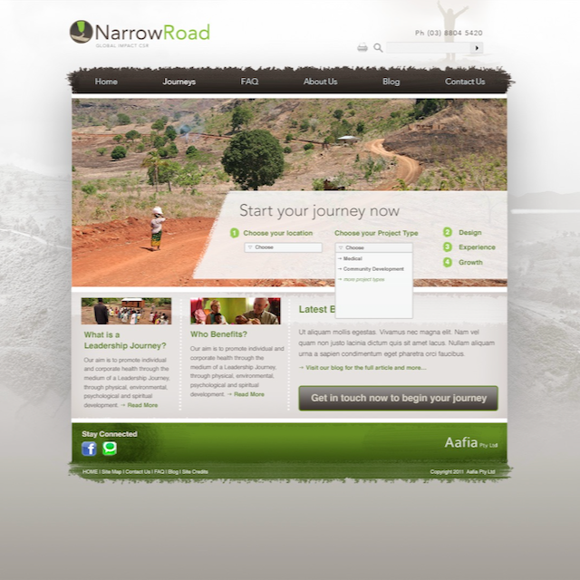
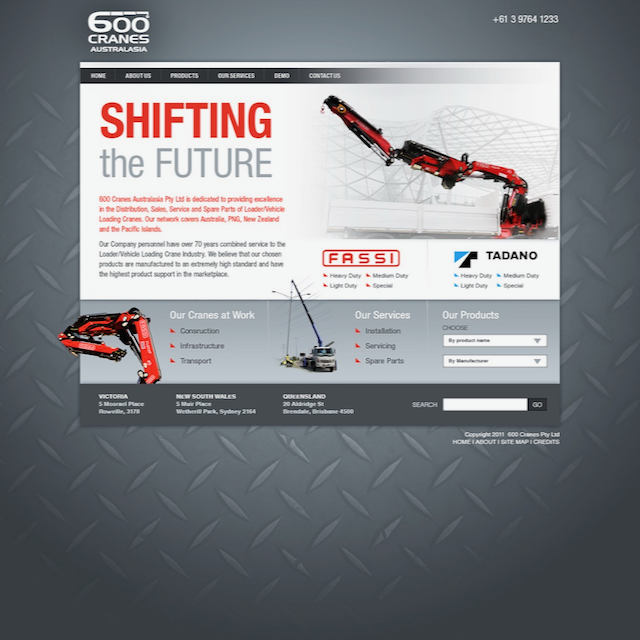
My first real steps into the world of UI design began in 2005-06 in Melbourne, Australia. I was lucky enough to find a place in a small web agency that was doing some innovative and solid work for the time. Designing for the web in the mid-2000's included many constraints that seem foreign in the modern world. But we had an amazing team: one project manager, one information architect, one developer, and myself. The way we worked together is now described as a cross-functional team. These were some of the best days of my career and I will forever be grateful for the opportunity. Working on various sites — large and small — for a wide range of clients gave me a solid foundation and allowed me to better understand a project in its entirety: the business side, the client's needs, the constraints, hazards, and the power of true collaboration. These are just a few samples of projects we worked on from 2006-2011. During this period, I was involved with the discovery, design and delivery of over 28 Web projects.
Why? - Problem
HOw? - Approach
What? - Solution
Monday Night Brewing: Reimagining the Site Experience for a local brewery
Description
I collaborated with my brother (swingfromtherafters.com) on a full site redesign for Monday Night Brewing. We provided UI design and interaction design, based on their provided user research and requirements. The final delivery was a working prototype in Adobe XD that would be used by developers working to build the final site.
Why? - Problem
Over the years, MNB's site had become almost unmanageable, a challenge to update for staff, and difficult to navigate. The site was not dynamic and provided no global search capability. The interface was also inconsistent and needed an update to better reflect recent changes in branding.
HOw? - Approach
We spent time talking with the MNB team to better understand some of the frustrations their users had been having when visiting the site. We worked with them to craft a site map and refine content for each site section that would help make the site more informative and satisfying to use.
What? - Solution
We provided a fully working prototype, showing interactions and wayfinding, that also included developer notes to streamline the build process. We also created consistency across the site to meet brand guidelines and provide more consistent wayfinding.
Selection of Older Prototypes
CINC Mid-Market CRM –– Tablet
View Prototype in InvisionCINC CRM Lead Import –– Mobile
View Prototype in InvisionCINC Partner Landing Pages –– Desktop
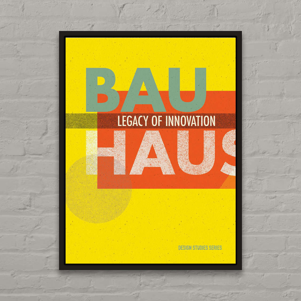
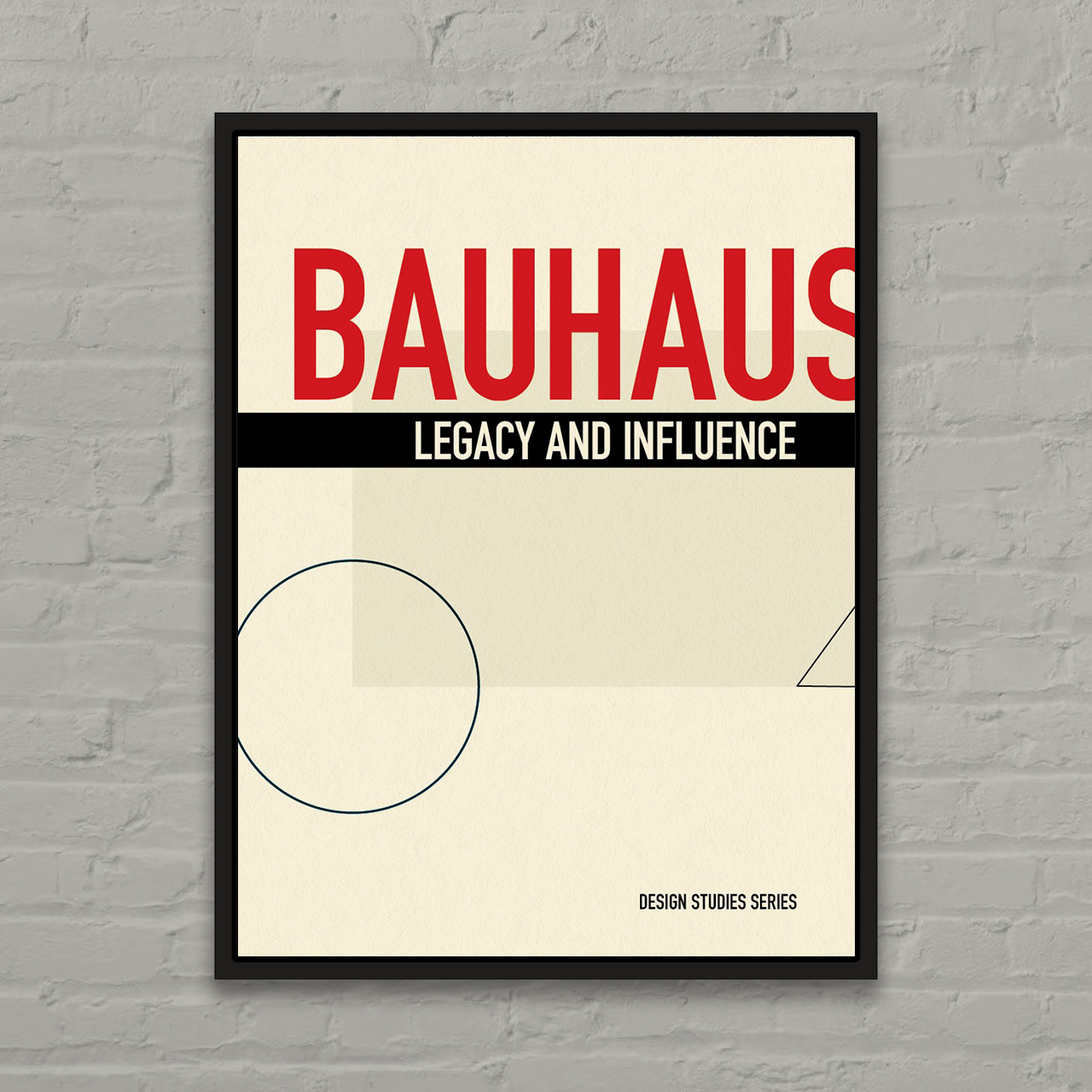
View Prototype in InvisionBauhaus Poster Concept
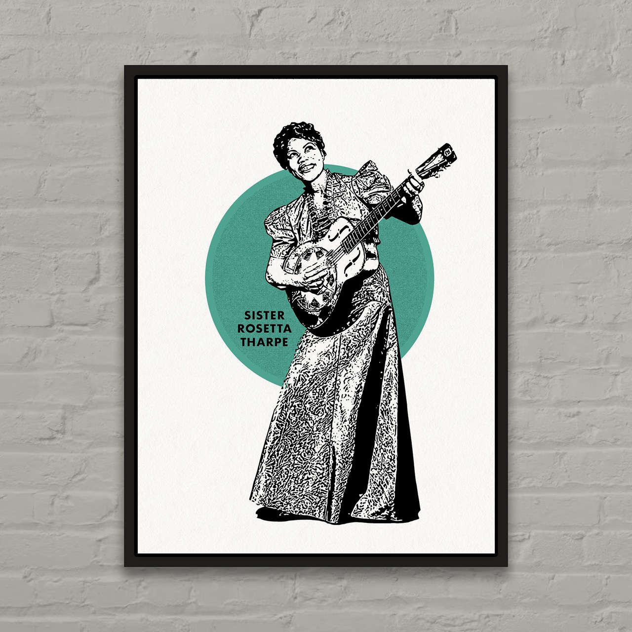
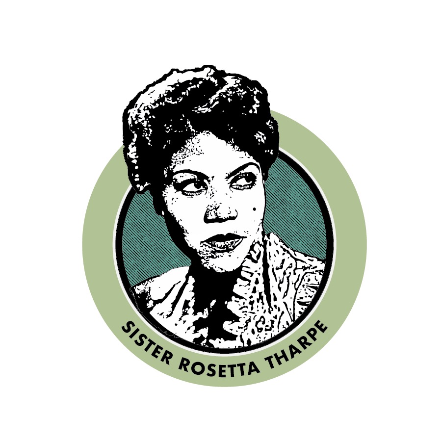
Sister Rosetta Tharpe Tribute
Random Geometric Art - 3x3


System-32 Grid Development Process


Capturing the Spirit of the Popmenu Platform: Popmenu Marketing


Assorted Logos, Marks and Icons


Chopin Poster Concept
.png)
.png)
.png)
.png)
Scenes from Nowhere (incomplete iso and low poly experiments)


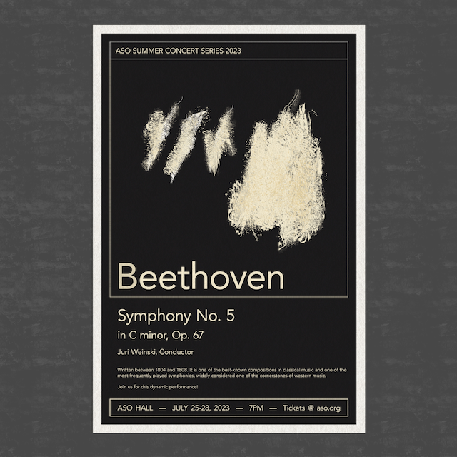
Classical Concert Series Poster Concepts
.png)
.png)
.png)
Letterform Experiment 01


"Futuristic City" Kids' Illustrations


Vintage-Inspired Classical Concert Posters


.png)

Techlab PNG Brand Mark


Investor Overview


Simple Proportion Poster Series


Favorite Musicians Poster Series


Simple Fractal Tree

System-32 Grid Development Process


Color and Contour Illustration Experiment

Color Wheel Exploration and Layout


Nested Triangle Pattern Exploration - Color and Shape


Triangle Pattern Experiment

CMYK Line Experiment


Motif and Variations (Circles)


Letterform Experiment 01


Screen Ratios and Musical Intervals


